Trulioo
Enabling customers to create
Enabling customers to create forms with a no-code custom form builder.
forms with a no-code custom
form builder.
UX Design
UX Research

Challenge
Trulioo had recently completed a round of usability testing, but had no design team in place to synthesize the data. My teammate, Amber Franz, reviewed 27 unmoderated usability tests and provided the team with actionable findings that we would use to improve the low-code form builder.
Test participants often clicked the button associated with the form to try to move on to the next step, while others would hesitate before identifying the correct button to progress.
Test participants had difficulty understanding the flow of the form creation process.
Test participants had the desire to build the form and edit it's properties in a single location.
With the data synthesized from the usability testing, our goal was to create a low-code form builder that enabled non-developers to create an identity verification flow to integrate into their services.
Target Audience
99% of Trulioo's customer base are developers who use their API to create identity verification flows. Trulioo wanted to expand their customer base by offering a low-code solution for non-developers.
99% of Trulioo's customer base are developers who use their API to create identity verification flows. Trulioo wanted to expand their customer base by offering a low-code solution for non-developers.
Scope & Constraints
Just as we thought we had completed a feature, the client would introduce new feature requirements. This was challenging as our understanding of the end product became a moving target. These challenges include:
Adding Columns
Conditional inputs based on Country
Linked steps within the verification flow
Success Rate and Recommendations
While this normally would be an issue of scope creep, we had more than enough budget to accommodate the client's needs.
Low-code Tools Research
I looked into other low-code platforms and solutions to better understand patterns currently in use. As I researched each, I asked myself the following questions:
How do they add to the page?
How do they edit the page?
How do they apply conditional logic?
What are they doing from an education standpoint?
How do they guide their customers through the experience?
What help options are available?
What external communities are there for this product? How many active community members?
What tools and resources do they provide?
The following external links show the results of this research:
Fixing the flow
With the way the page was laid out, test participants often would click on the button in the form builder which lead nowhere but confusion.
With the way the page was laid out, test participants often would click on the button in the form builder which lead nowhere but confusion.
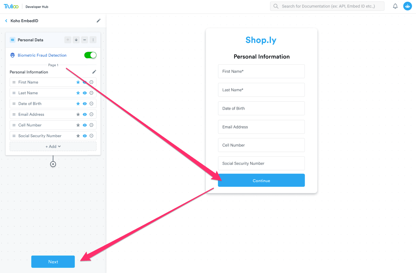
Given how we read from top left to bottom right, the way test participants behaved made sense. Additionally, both buttons are styled the same and the button in the form had more visual weight
Given how we read from top left to bottom right, the way test participants behaved made sense. Additionally, both buttons are styled the same and the button in the form had more visual weight
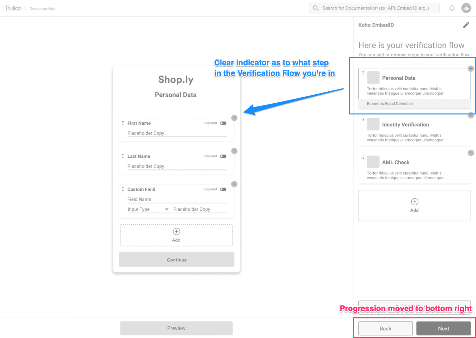
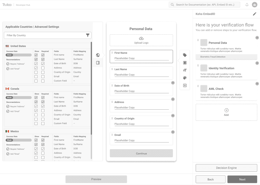
By moving the "Next" and "Back" buttons to the bottom right, we place the means to progress through the experience in an area where our eyes naturally end as left-to-right readers. Additionally, the verification flow has been added to this right panel and clearly highlights the area in the flow the customer is working in.
By moving the "Next" and "Back" buttons to the bottom right, we place the means to progress through the experience in an area where our eyes naturally end as left-to-right readers. Additionally, the verification flow has been added to this right panel and clearly highlights the area in the flow the customer is working in.
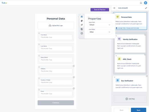
Styling and Inline Editing
While the previous iteration solved the issues of flow, we still had not addressed the desire to style and edit inline within the form itself.
While the previous iteration solved the issues of flow, we still had not addressed the desire to style and edit inline within the form itself.
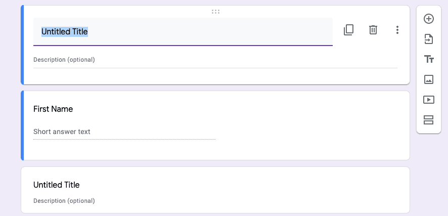
I remembered briefly looking into Google Forms and how they empower users to create custom forms. They had a toolbar that followed the user based on the field selected. That pattern almost fit perfectly with what I was trying to do, but I had to figure out how to modify it to fit our needs. Google Forms version was far simpler. Clicking on a tool lead to an immediate action. The Trulioo toolbar opens a panel that allows for further customization upon click.
I remembered briefly looking into Google Forms and how they empower users to create custom forms. They had a toolbar that followed the user based on the field selected. That pattern almost fit perfectly with what I was trying to do, but I had to figure out how to modify it to fit our needs. Google Forms version was far simpler. Clicking on a tool lead to an immediate action. The Trulioo toolbar opens a panel that allows for further customization upon click.
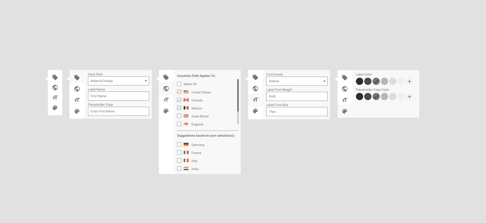
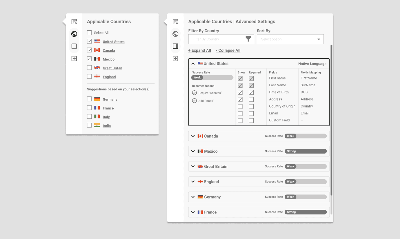
This first iteration of the toolbar was well-received by stakeholders. They applauded it's simplicity, but had concerns about countries. I learned that it would be tedious to select individual countries for their customers who had 80+ countries to concern themselves with. In addition to that, we learned that the form would need to have the ability to have multiple columns.
This first iteration of the toolbar was well-received by stakeholders. They applauded it's simplicity, but had concerns about countries. I learned that it would be tedious to select individual countries for their customers who had 80+ countries to concern themselves with. In addition to that, we learned that the form would need to have the ability to have multiple columns.
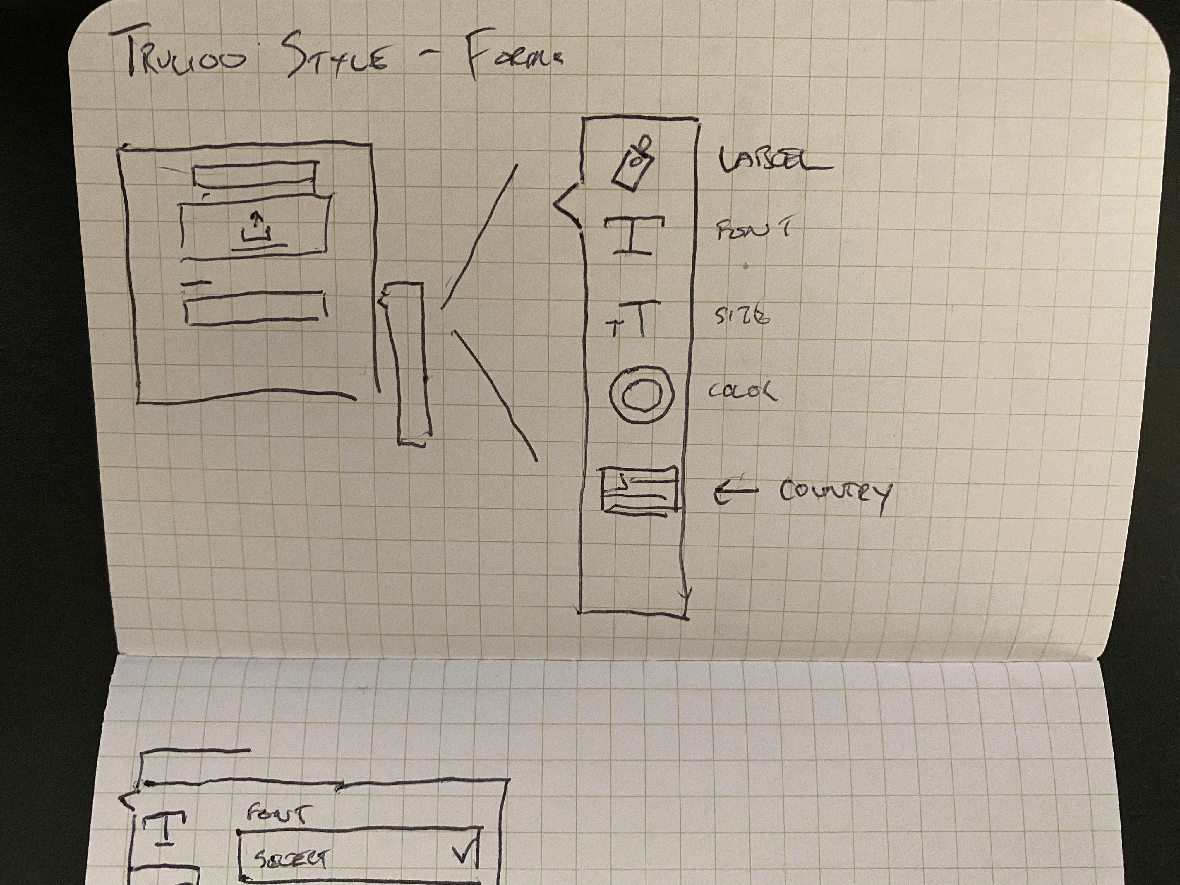
Adding Columns
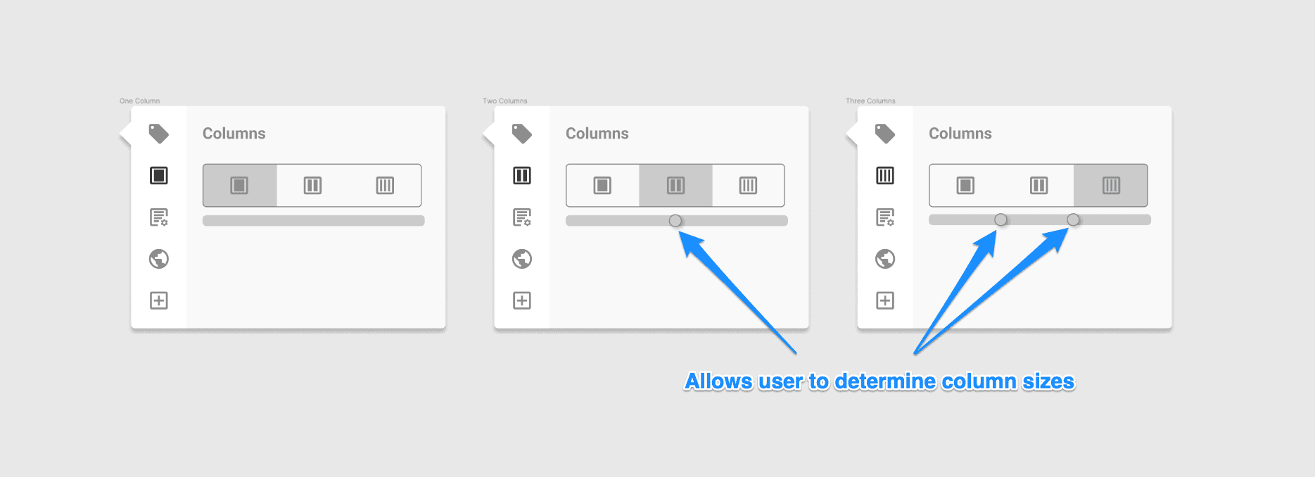
When I was working through this problem, I thought about how the various tools I use implement columns. Based on the feedback from the stakeholders, I knew that the form only needed to support a maximum of three columns. Rather than approach columns as a global property, which would lead to tab flow issues, I made the recommendation to handle columns at the individual row level. Additionally, a user may want to customize the width of each column. The pattern I followed was similar to how gradients and colors are handled.
When I was working through this problem, I thought about how the various tools I use implement columns. Based on the feedback from the stakeholders, I knew that the form only needed to support a maximum of three columns. Rather than approach columns as a global property, which would lead to tab flow issues, I made the recommendation to handle columns at the individual row level. Additionally, a user may want to customize the width of each column. The pattern I followed was similar to how gradients and colors are handled.
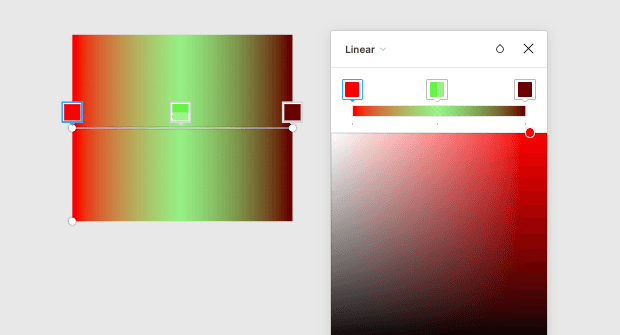
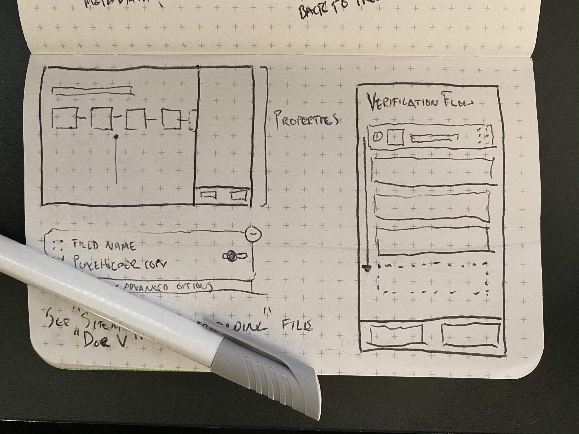
The inspiration behind the column widths sliders.
The inspiration behind the column widths sliders.
A little too complicated
The next iteration of the toolbar split the toolbar into left and right sides. The idea here is the customizing countries was something power users would do, and the majority of users wouldn't concern themselves with it. However, this fragmentation of the toolbar only lead to confusion from the stakeholders, and didn't align with my flow recommendation. I also realized how quickly the toolbar and overall UI was becoming cluttered.
The next iteration of the toolbar split the toolbar into left and right sides. The idea here is the customizing countries was something power users would do, and the majority of users wouldn't concern themselves with it. However, this fragmentation of the toolbar only lead to confusion from the stakeholders, and didn't align with my flow recommendation. I also realized how quickly the toolbar and overall UI was becoming cluttered.
Simplifying the toolbar
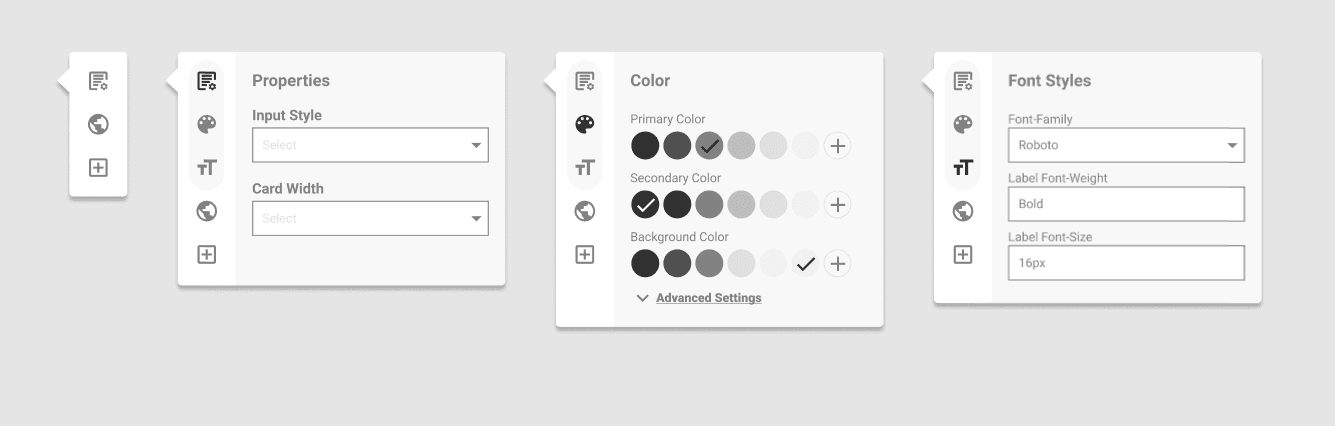
Rather than have two separate toolbars on both sides of the form, I consolidated all of the tools into a single toolbar. This isn't far off from the earlier iterations, but this iteration adds a little more depth by adding nested tools.
By simplifying the toolbar, were able to include countries and success rate into the properties panel as well.
Nested Tools
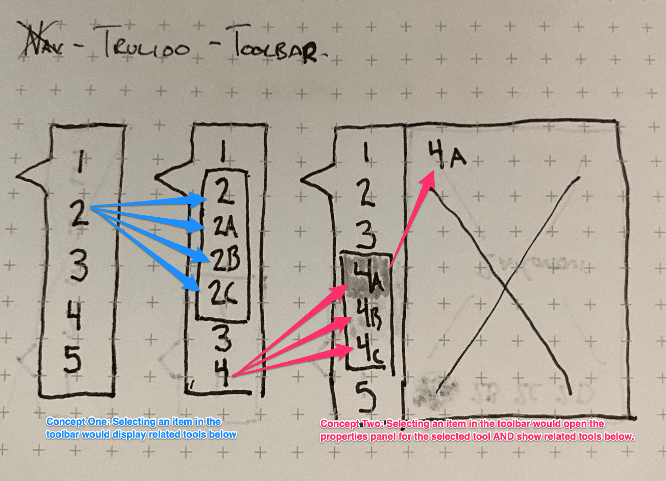
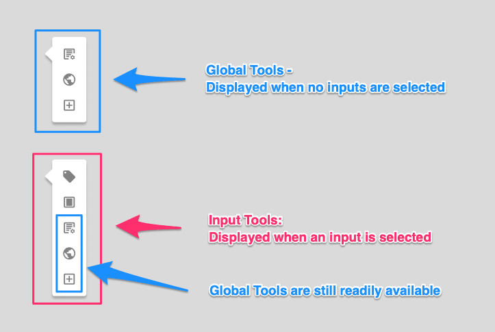
Upon interaction with a tool, two things could happen:
The properties panel for the selected tool will open.
Related tools will be displayed beneath the selected tool.
Upon interaction with a tool, two things could happen:
The properties panel for the selected tool will open.
Related tools will be displayed beneath the selected tool.
Applying Styles
After several iterations stemming from both usability testing and client feedback, the problem had been solved. Amber, the UX Lead, then took on applying the Trulioo styles to the wireframes.
After several iterations stemming from both usability testing and client feedback, the problem had been solved. Amber, the UX Lead, then took on applying the Trulioo styles to the wireframes.
Conclusion
Services
UI Design
UX Research
Tools
Figma
team
UX Designer
Tyreil Poosri
UX Designer
Amber Franz
Account Executive
Jamie Maslam

