Symetra
Designing Symetra's
Digital Customer Experience
UI Design
UX Research
Consulting




Challenge
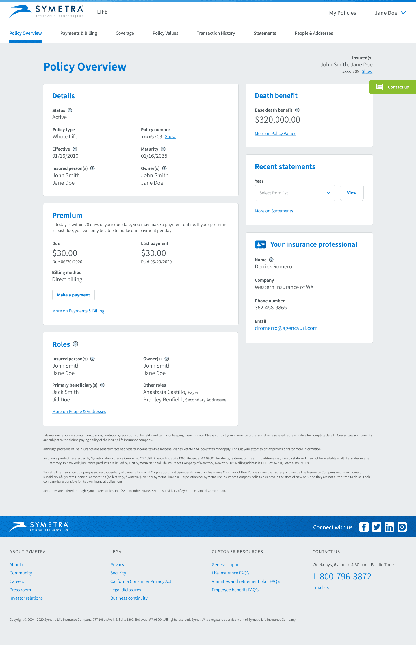
Symetra's customer experience was nearly completely analog, with everything from statements to billing, and even payments, being handled on paper. They wanted to create a digital customer experience where customers could handle all of their needs.
Symetra's customer experience was nearly completely analog, with everything from statements to billing, and even payments, being handled on paper. They wanted to create a digital customer experience where customers could handle all of their needs.
Target Audience
Their target audience were working professionals ages 45 and up, with a household income of $100k-$150k.
Their target audience were working professionals ages 45 and up, with a household income of $100k-$150k.
My Role & Responsibilities
As a UX Designer on the team, I wore a lot of hats. My responsibilities included:
Creating and maintaining the design library
Creating wireframes, mockups, and prototypes
Usability testing
Education and training
Writing user stories and acceptance criteria
Sprint Planning
It was the largest team I have ever been a part of. The team consisted of Business Analysts (3), Product Owners (4), Developers (9), and Designers (5), all working together to create the product.
Creating & Maintaining a UI Library
This was a collaborative effort between two product teams: Customer and Partner. The design library needed to be utilized by both teams.
While the responsibility was shared amongst the design team, I contributed specifically to the following sections of the design library:
This was a collaborative effort between two product teams: Customer and Partner. The design library needed to be utilized by both teams.
While the responsibility was shared amongst the design team, I contributed specifically to the following sections of the design library:
Education & Training
While the designers from Fresh Consulting were well-versed in using Figma, Symetra's designers were not. In the beginning, there were times where I would need to recreate work that the Symetra designers created to avoid accumulating design debt. This lead to the creation of a couple trainings with the intention of removing duplicating efforts altogether.
Below you'll find links to the Figma working files. An active learning experience is the best way to learn, so these trainings were designed around "Discussion" and "Practice Doing".
Working with Text Resizing - Learn the pros and cons of using text resizing
Auto Layout Basics - Create flexible layouts and components using Auto Layout
Organizing The Work
We initially had all of the features contained in a single Figma file. This quickly became unwieldy as each feature progressed and grew. Stakeholders, Business Analysts, Product Owners, and Developers had difficulty finding the designs they needed.The solution for this was to separate each feature into it's own Figma file using the specific page structure outlined in the page below.
Understanding Figma’s Page Structure (External Notion Page)
Handing Off The Designs
Design and development teams moved in tandem, working on the same features during the same sprints. This lead to confusion as to what was ready for developers to build out, and frustration when something they built changed unexpectedly. To combat this, I wrote a handoff guide to ensure everyone new the status of any given feature.
Design/Development Handoff Guide (External Notion Page)
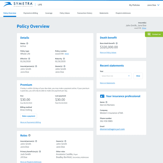
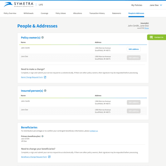
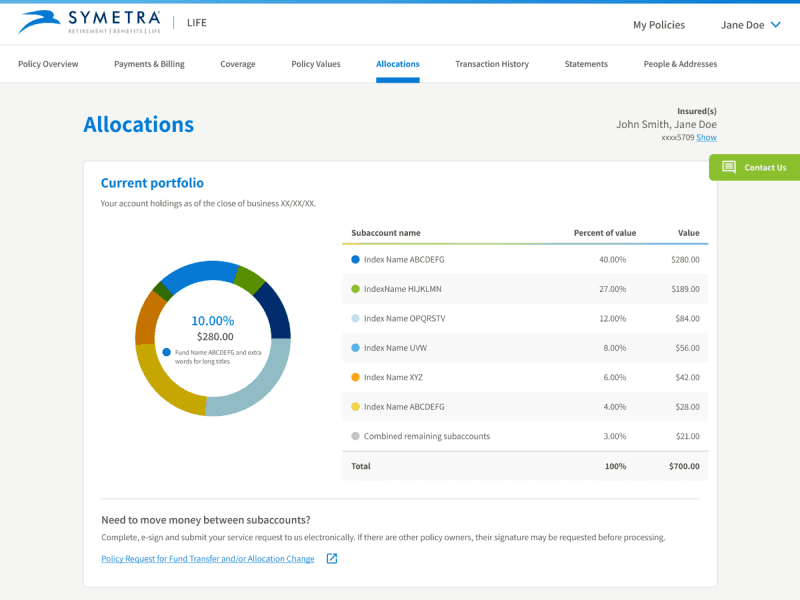
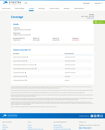
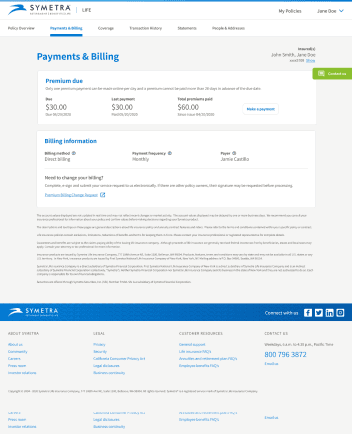
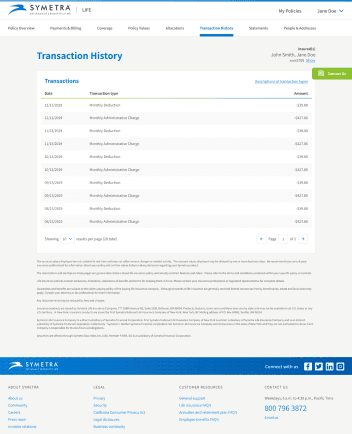
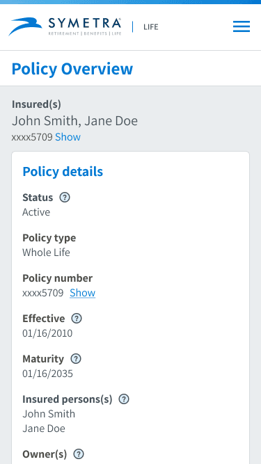
Wireframes & Mockups
Each of the following links will open to an external Notion page:
I've included a high-level overview of the work below this section.
Each of the following links will open to an external Notion page:
I've included a high-level overview of the work below this section.






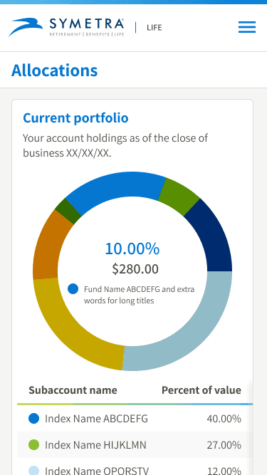
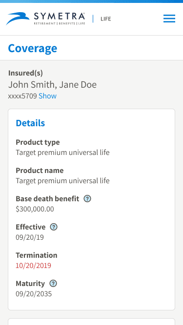
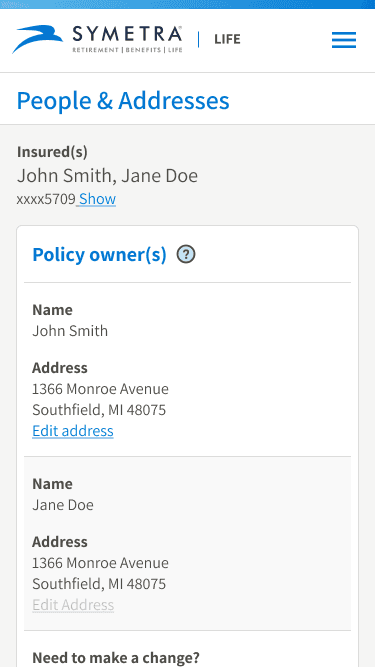
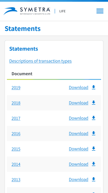


Mobile Screens
Usability Testing with Usertesting.com
Both Symetra and Fresh Consulting designers had no prior experience with UserTesting.com, so I created a workflow for the team to follow.
Both Symetra and Fresh Consulting designers had no prior experience with UserTesting.com, so I created a workflow for the team to follow.
Testing Policy Details v2
I tested the “Policy Details” page for both Desktop and Mobile sizes. See the outcomes below:
I tested the “Policy Details” page for both Desktop and Mobile sizes. See the outcomes below:
Conclusion
Closing Thoughts
Symetra's Digital Customer Experience launched in December of 2020. I learned how much I enjoyed working in a product design environment. Often times in a traditional agency setting, you'll create something and never touch it again. There's something to be said about designing something and continually iterating on it to make it better.
Services
UI Design
UX Research
Consulting
Tools
Figma
Usertesting.com

